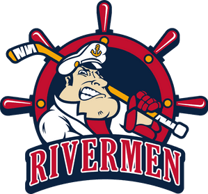
Rivermen Unveil New Primary Logo For 2021-22 Season

March 19, 2021 - 10:35 am
Rivermen Unveil New Primary Logo For 2021-22 Season
Rivermen strike new wave, new look ahead of a return to ice
Peoria, IL – The Peoria Rivermen revealed their new primary logo ahead of the 2021-22 SPHL season Friday morning. 2022 will signify the 40 year anniversary of professional hockey arriving in Central Illinois, and the Rivermen will celebrate this milestone by sporting a variety of different jerseys with multiple logos; all new and updated for the team’s return to action this fall.
The “new” primary logo features the iconic Peoria paddlewheel design, but redefined and modernized for the current wave of Rivermen hockey. The traditional red, yellow, and blue colors are still featured, though the standard yellow now resembles a more rich, gold appearance, which is reflected in both the city skyline and river waves that have been redesigned toward the bottom in the inside of the paddlewheel.
“Coming out of the pandemic and entering our 40th Anniversary of pro hockey in Peoria, we felt it was vital to look at modernizing our trademarks to create excitement for the Rivermen returning to Carver Arena later this year,” said team Owner/COO Bart Rogers. “Today we are launching our primary Rivermen paddlewheel logo, keeping the history and tradition that the logo has meant to this franchise for parts of four decades. We are excited in the days and weeks ahead to showcase other logos planned for the upcoming season and begin our push for the players and the community to return to Carver Arena.”
Additional information regarding the 2021-22 Peoria Rivermen season is expected later this spring. Be sure to follow the Rivermen on Facebook, Twitter, and Instagram for the latest news and updates.